Designing the next-generation data platform for the enterprise
Project Premise
I was tasked with designing a data dashboard for a fictional startup called Tufte.ai. The company offers businesses a data platform that enables users to gain insights easily and engage with their data using AI.
Approach
Given the complexity of the project, I decided to split my approach into 4 stages:
Understand the product and the end user I’m designing for.
Validate my hypotheses by exploring existing products.
Determine the platform’s structure, feature set, and UX.
Mockup, iterate, and complete final designs.
Understand
-
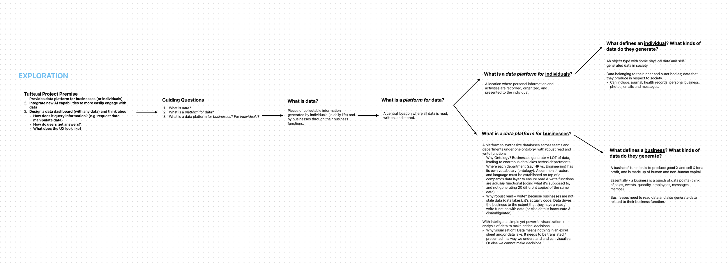
Pieces of collectable information that are generated by individuals (in daily life) and by businesses through their business functions.
-
A central location where all data is read, written, and stored.
-
A business's function is to produce good X and sell X for a profit and is made up of both human and non-human capital.
Essentially, a business is a bunch of data points (think of sales, events, quantity, employees, messages, memos). Thus, they will read and write data related to their business function every day.
-
A data platform for businesses, then, synthesizes data across teams, departments, projects, etc., under one dictionary (or ontology), with robust read and write functions that can drive the business with data.
My notes from early ideation.
2. Exploring existing products
Next, I studied a few companies’ products in the exploration process to better inform me of what good dashboard design, genAI design, and data management systems look like.
Screenshots from Apple, Palantir, Ramp, Perplexity AI, and Exa.ai
Modular aesthetic: Apple
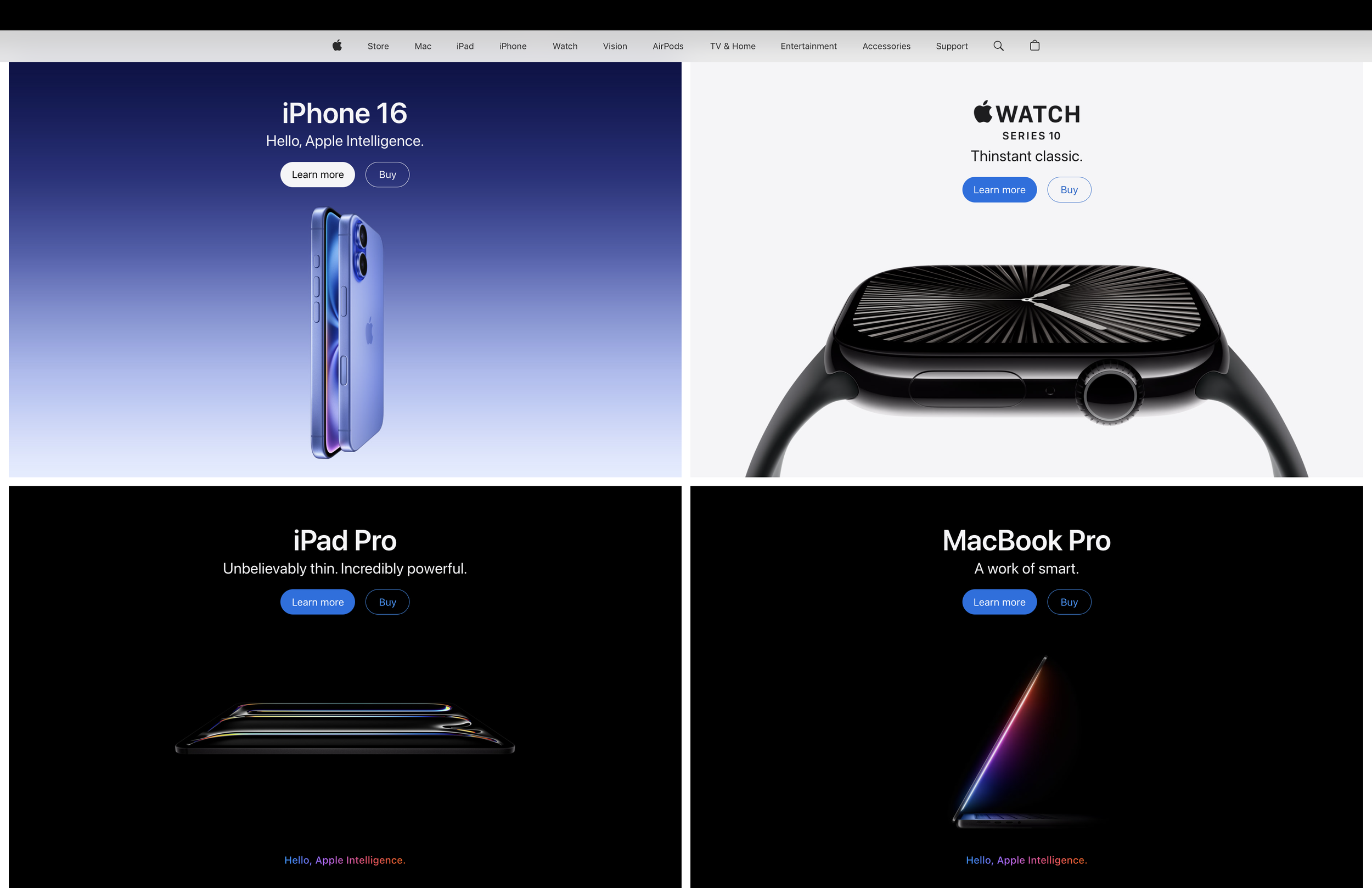
Screenshot from Apple’s website as of March 2025
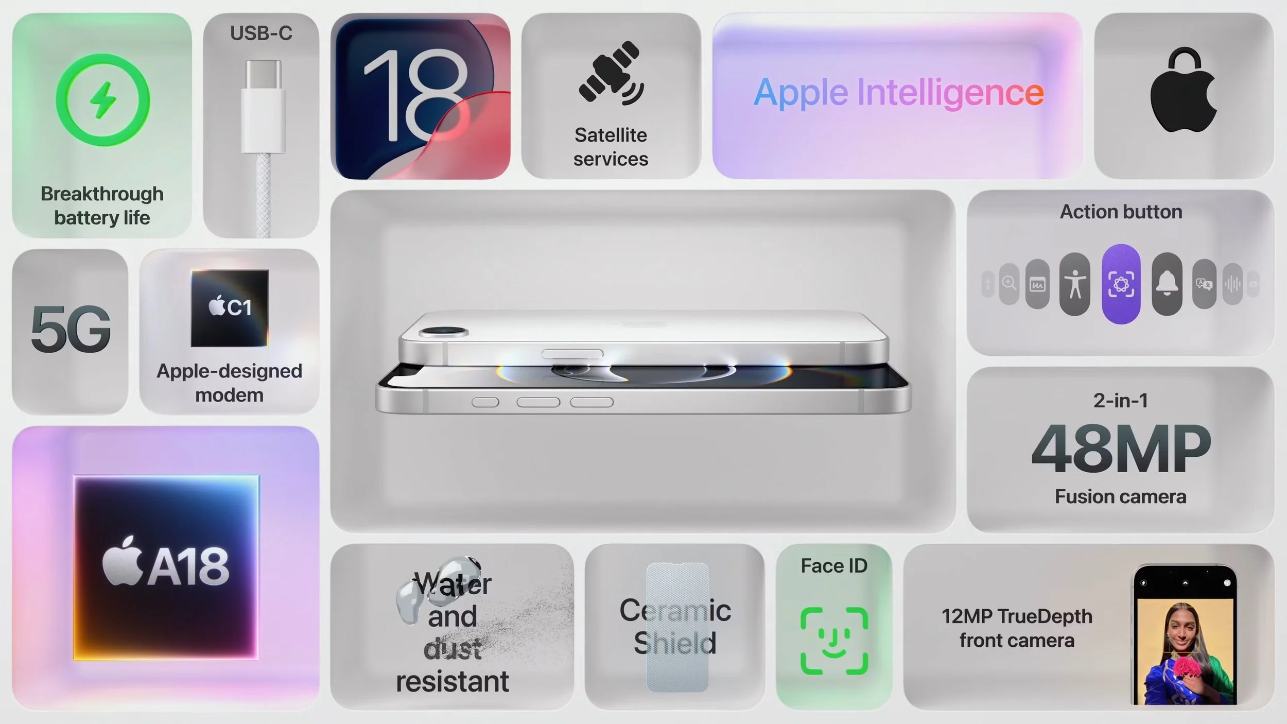
Screenshot from Apple’s launch of its iPhone 16e
A core UX strength of modular design is the consistent layout and navigation patterns maintained across a site or app. Reusing the same modules (menus, content cards, filters, etc.) on multiple pages means users don’t have to re-learn the interface at each step. This reduces cognitive load and makes it easier to find information.
Apple’s website follows this modular system to showcase its products and services. Whether you’re browsing for iPhones, MacBooks, images, or accessories, the same set of modules is used to display product information, images, and pricing. The site is flexible, visually consistent, and easy to navigate.
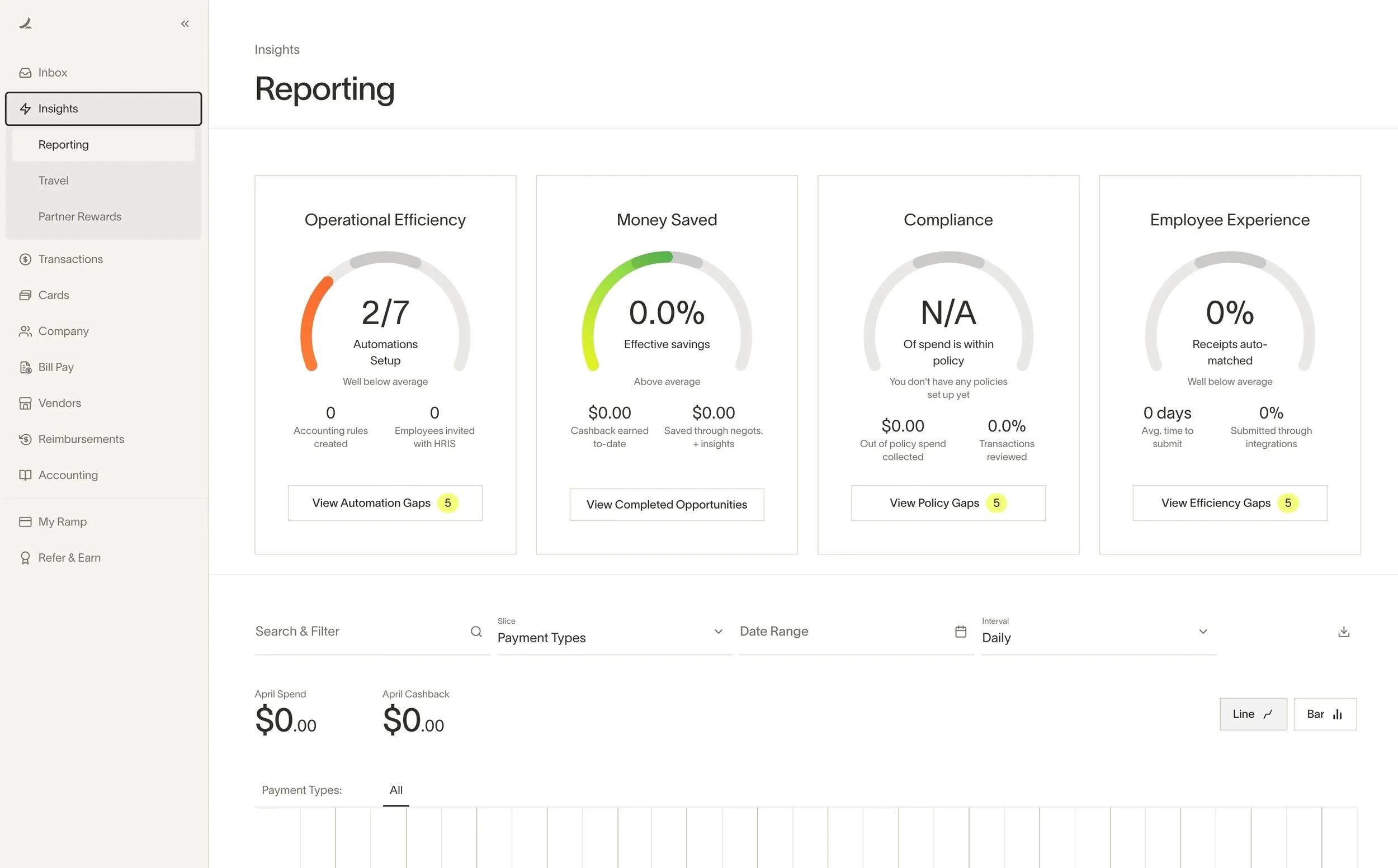
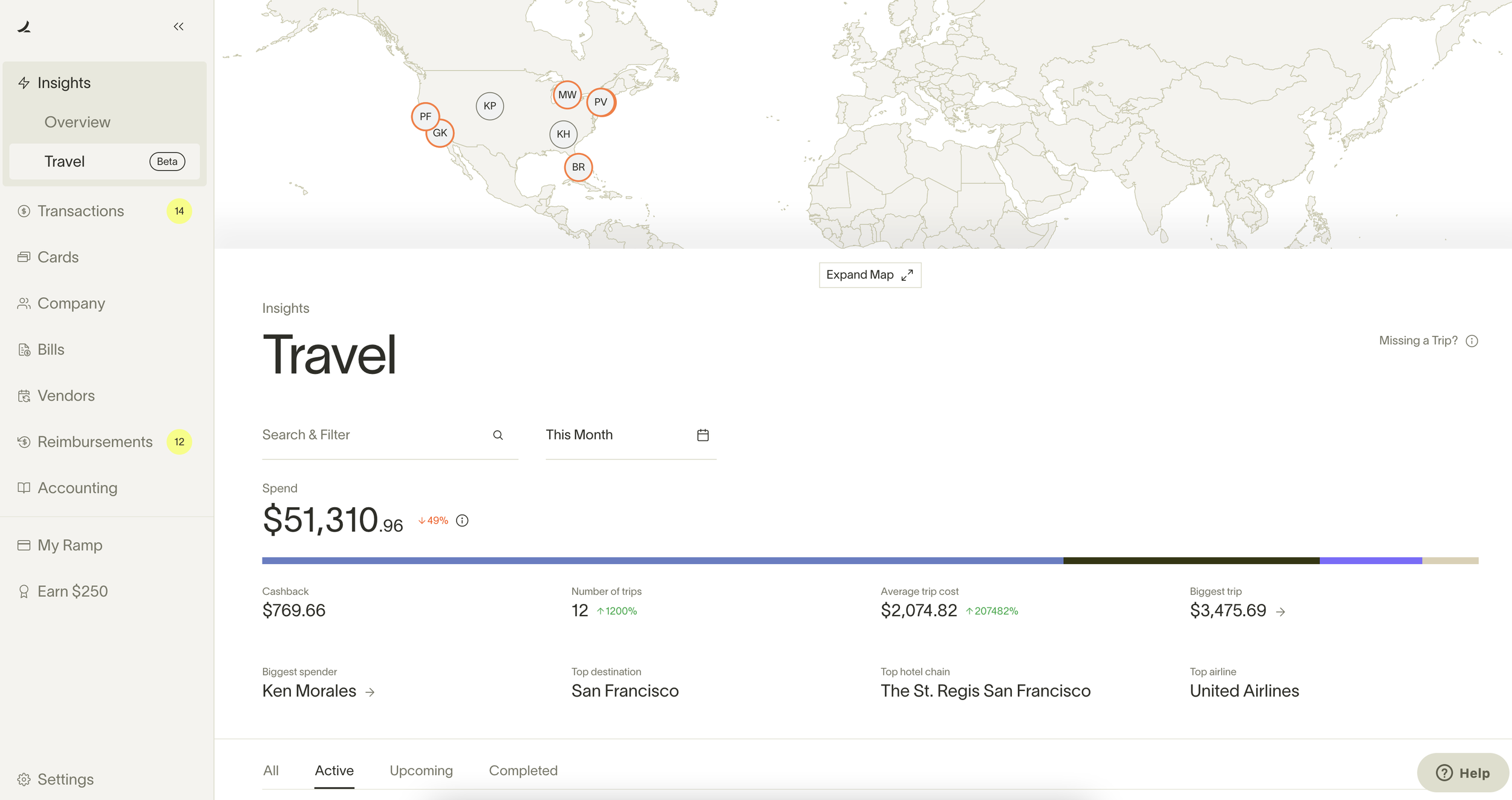
Dashboard design: Ramp
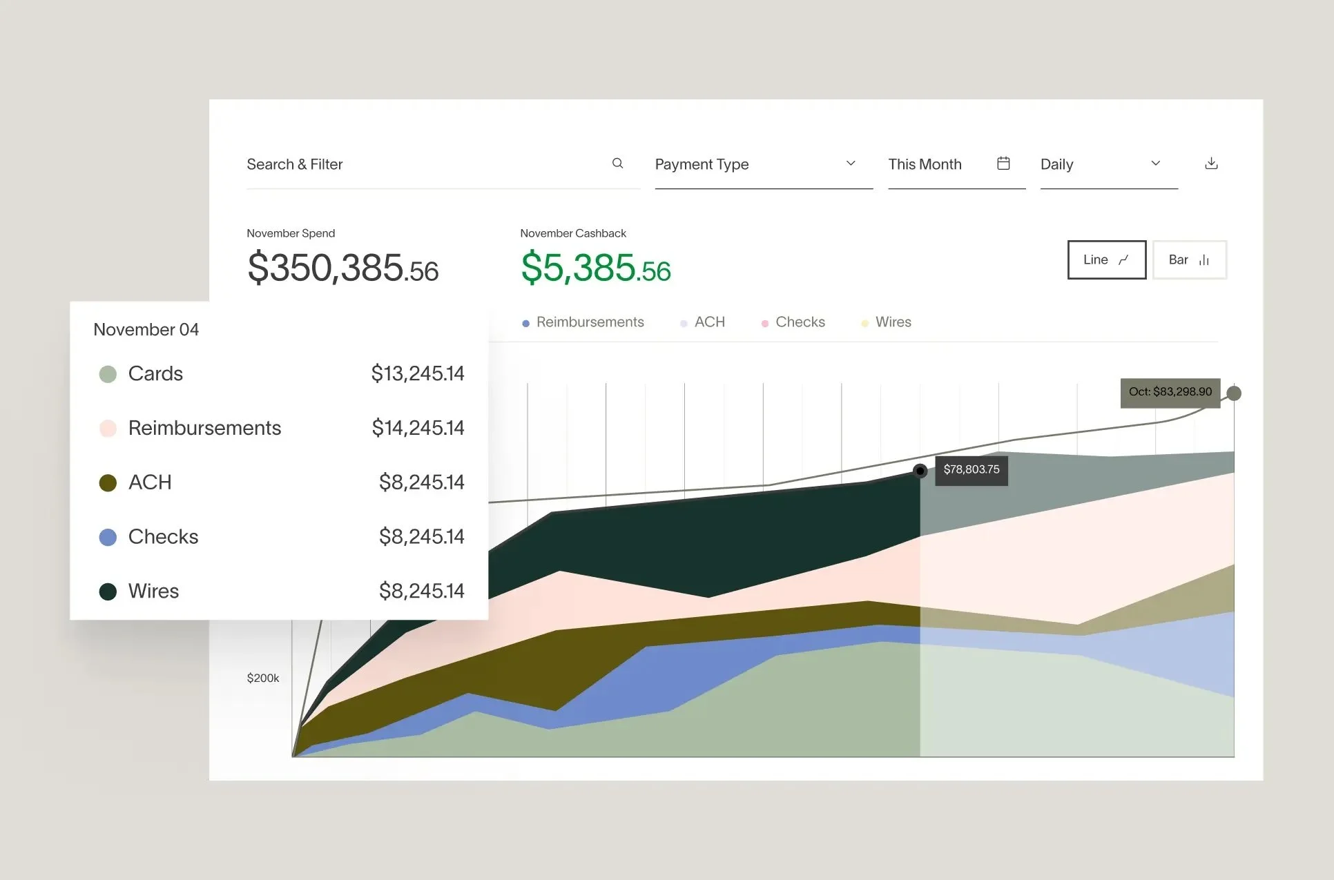
Screenshots from Ramp’s website
A wide variety of data visualizations enhances users' ability to interpret data by catering to diverse learning styles and levels of data literacy. Different visualization types highlight various aspects of data, making complex information more accessible and revealing patterns that might be hidden in other formats.
Ramp’s financial dashboard incorporates a range of charts, graphs, tables, and views in order to help its users to explore, analyze, and ultimately make data-driven decisions more confidently.
GenAI design: Perplexity & Exa.ai
Screenshots from Perplexity’s website
Screenshots from Exa.ai’s website
When ChatGPT was introduced to the world in late 2022, it gained a whopping 100 million users within two months, in large part because of how intuitive its UX was. Unlike earlier AI tools that required technical expertise, ChatGPT presented users with a clean, text-based input field reminiscent of familiar messaging platforms like SMS or WhatsApp. This minimalistic design reduced cognitive load, enabling users of all technical backgrounds to engage with the tool immediately.
ChatGPT’s legacy is far-reaching. Today, almost every gen-AI company’s chatbot product has the same simple, intuitive UI — like Perplexity and Exa.ai. But where these two companies’ products stand out is their source-based search queries that back up every sentence that it generates. Perplexity leaves “footnotes” in its responses that are easily accessible; Exa.ai presents the information in the reverse manner by using semantic search (a searching technique that uses contextual meaning for more relevant results) to present the best web sources, with a summary of each source presented in the right-hand sidebar. When it comes to building AI that is backed by real data and sources, Perplexity and Exa.ai teach an important lesson in their designs.
Ontology-based data management: Palantir
Screenshots of Palantir’s Ontology system, taken from its documentation page
While I looked for guidance on Tufte’s internal structure, I looked to Palantir’s unique Ontology system.
The concept of an ontology has its roots in metaphysics, where this branch of philosophy inquires into the nature of existence, being, and reality. But seeking into the structure of such fundamentals requires a robust way to organize their hierarchy and structure, which means fundamental components and relationships within a given domain of existence have to be specified.
Organizations, like metaphysics, can’t thrive without a clear structure. Without an ontology, teams within departments face communication challenges (i.e, the read function doesn’t work), as the same vocabulary can hold different meanings. Similarly, new data are fed into disparate databases with their own set of vocabulary and terms (i.e, the write function doesn't work). And when data is interpreted by organization leaders, key decisions are made based on essentially inaccurate data. Consequently, ontologically-challenged organizations encounter data silos, inconsistencies, and increased complexity, hindering digital transformation and exacerbating inefficiencies in data management and utilization.
Palantir’s Ontology, then, creates a unified semantic layer that aligns digital assets—such as datasets and models—with their real-world counterparts, including physical assets and business concepts. This structured approach enhances data connectivity, interpretability, and scalability, facilitating effective decision-making and operational efficiency across the organization.
You can learn more about Palantir’s Ontology in this video.
Notes from Palantir’s documentation and YouTube videos about the Ontology
3. Platform structure, feature set, UX
After a couple of days of exploration into exemplary data structures, data dashboards, genAI platforms, and design techniques, I outlined the overall structure that Tufte.ai will take on.
-
Give users an expansive and customizable visualization of the most important/relevant data to them, with suggested AI insights.
-
Using genAI, the assistant will answer users’ queries by citing the most relevant data/dataset while deciding intelligently any analysis or visualization it needs to undertake to best answer the user’s question.
-
Define the organization’s ontology, manage its data, and offer robust read and write functions via integrations and manual import/export methods.
Notes from feature set ideation
Dashboard
At an organization, different teams have different priorities, goals, and tasks. As a result, Tufte.ai’s dashboard needs to work universally and provide an extreme level of functionality (to work for the most junior level employee to the CEO).
As a result, the dashboard needs to have/be:
Pinned/favorited data objects.
Ability to connect any variables and see their effects (e.g, delays and total cost, or which event types are related to delays).
Monitor data and present alerts and findings as necessary.
Provide a wide variety of view types (e.g, map view) and visualizations (e.g, bar chart vs. network graph).
Access AI assistant instantly.
Fully customizable.
Assistant
Even with a functional dashboard and structured platform, sometimes, users may simply be confused or lost in the complexities of the data. The assistant’s job is to break down complexity and answer questions in the most natural, interpretable way while citing any relevant data sources. This means that it has advanced capabilities to retrieve, read, analyze, visualize, and even make inferences based on data.
For the sake of this project, it is assumed that the assistant is compliant with all privacy standards and is using the most capable reasoning models.
As a result, the assistant needs to have/be:
Simple to navigate and use.
Ability to retrieve, read, analyze, visualize, cite, and make inferences based on data.
Filters to ensure cited data is only from certain sources.
Ontology Management
The Ontology is effectively the organization’s digital twin. Behind the UI mockup, the system is assumed to be integrated with the organization's critical services. It is set up to feed all data into the right locations (e.g, data type, property, dependent, etc.).
While this screen manages the organization’s ontological structure, it does not lack any data management tools. Integrations, read & write functions, storage, and data streams are essential to ensure every part of the organization’s data structure is well-maintained.
As a result, the ontology management needs to have/be:
Simple to navigate and use.
Fully customizable to show relevant/pinned data types.
Granular control of ontological structure.
Semantic search to quickly find datasets.
Full-data management features.
Granular detail of each data/object/property type to disambiguate unclear terms.
Now,
Introducing Tufte.ai, the next-gen enterprise data platform.
Dashboard
The dashboard view offers exceptional customizability and insights at a glance. Users can create widgets to view the latest data or create custom functions on objects to receive instant insights. Depending on your role, the assistant will intelligently infer from the data to bring alerts to your attention.
Widgets are optimized to present the right amount of information, with red, green, and orange UI colors to underscore key figures visually. A subtle shadow is lit behind each widget to enhance a three-dimensional feel, separating them from the dark background.
Whether you’re the CEO of the company or the junior employee, you have the ability to choose views that are most important to you. For instance, if you’re the flight coordinator for an intergalactic transportation company, you can create a map view to view flights taking place in real time. Flight details can also be presented by customizing the widget to present fleet and flight information.
The sidebar menu is expanded upon hover and tucked away when interacting with the main dashboard. Access to the assistant is made more accessible with the circular widget on the bottom-right corner.
Answers from the assistant are laid out in a chat/messages format in ChatGPT fashion. Each cited statistic is linked directly to the data source via the Ontology. Details such as data type and data origin are presented on a sidebar to the right that can be made persistent or hidden.
Granular details of each data type are presented thoroughly at a glance inside the ontology. For instance, the object type “Starship” has 101 objects in the dataset “Fleet”, with over 15 properties and 5 other objects linked to it. It also has 5 dependents that could be affected if “Starship” objects were edited (e.g. some widgets in the dashboard will stop working if “Starship” was deleted). Finally, users are given direct access to its data sources and can see how much the organization has used the data.
Tufte’s data management page allows users to manage data integrations with third-party applications, manually read & write data to the database, and view different databases’ storage status at a glance.
Search results for data types or datasets are not just vector or keyword based but context-aware via semantic search, increasing accuracy and efficiency.
Tufte’s AI assistant combines design principles from ChatGPT, Perplexity, and Exa.ai to form a source-based chatbot for business queries.
Filters on the left-hand side allow users to narrow query results to a specific data source, type, or date range. This allows for faster and more accurate queries. Recent searches are visible on the right-hand side to let users quickly jump back into a past conversation. Finally, the assistant constantly monitors new data to provide actionable insights and help them make key decisions.
Assistant
The ontology dashboard gives authorized users full control of their organization’s data structure and data streams, with robust methods to read, write, and store data.
Inspired by Palantir’s Foundry product, the ontology’s main page displays the organization’s data structure with numerical values and edit options. The second row allows users to customize their view by pinning useful data types or viewing recently viewed objects. For instance, pinned link types show weighted relationships between delays, traffic control, maintenance, and passenger disruption issues based on data, allowing users to draw quick and accurate insights.
The right-hand side panel provides direct access to different data types and other data management features.
Ontology Management
Branding
As a data platform that helps users understand their data, Tufte’s logo was designed with a pointilist style that reflects clarity and its ability to discern important data points from unimportant ones.
Final logo design
Examples found on pinterest
Takeaways
Functional UI needs to conform to its internal structure.
Organizations require robust read and write functions.
Teams within organizations have different levels of data literacy and need customization and a variety of visualization methods.
Consistency and familiarity above all else in UX design.
AI will help democratize data analysis.
Appendix
Typography
Icons
